The Differential | #4
David McCarthy
Quantum Health accelerates. Jellyvision pens a wonderful retention asset. Carelon launches an interactive SDOH map. What could a navigation ad look like if it aimed to genuinely depict support? What’s missing from B2B healthcare landing pages and social ads?
B2B healthcare marketing, in the feed
Navigation company Quantum Health recently hired a new chief communications officer, and their marketing efforts seem to reflect that momentum. The company is hosting a webcast with SHRM on the value of navigation, and they were recently featured on the Nasdaq. See the landing page
Evernorth, Cigna’s health-services arm, continues ramping up its content program, lately by sharing break-out-session content from its recent event, Outcomes+. The most recent session focuses on healthcare delivery transformation. Watch the session
Jellyvision, a beloved Chicago-based company that provides benefits education/engagement/enrollment programs, published a unique bottom-funnel article on why a former client returned. It may not break any engagement records for the brand, but I love this as a bottom-funnel and retention play. Read the article
Cohere Health, a startup focused on UM, including prior auth, has launched a newsletter, titled UM Connects. Cohere is competing with a few incumbents, so it will be interesting to see whether and how they differentiate their content. See the landing page
Provider-analytics company Care Journey is offering a certification course on value-based care. I’m always shocked more healthcare brands don’t offer this, given the benefits, likely potential additional revenue, word-of-mouth referrals, free publicity on attendees’ LinkedIn profiles, and the ability to instill in the market the brand’s narrative (e.g., “inbound marketing”). Care Journey is an absolute content powerhouse. See the certification landing page
On a similar note about newsletters, data-platform company Innovacer has launched a LinkedIn newsletter, “Innovation Accelerator.” The newsletter thus far has focused largely on Innovacer’s accomplishments and products and, somewhat surprisingly explicitly, urged healthcare leaders to ignore Salesforce’s CRM because it’s not a healthcare-native solution. See the newsletter
Perhaps too often in B2B healthcare marketing, we think of lead magnet content as solely ebooks and white papers. Big Health pulled a trick out of other industries’ playbook: they created a calculator to “measure the impact of your mental health benefits.” (I’m curious how it’s performing; the first four questions are lead-generation/qualification questions.) See the quiz landing page
Speaking of interactive content, Carelon, Elevance Health’s health-services brand, launched an interactive map that assesses SDOH at the community level. Visitors can filter for insights on food insecurity, housing, education, transportation, and other factors. I will be interested to see how many links a piece of content like this acquires over the next few months. (Note: Carelon is my employer.) See the map
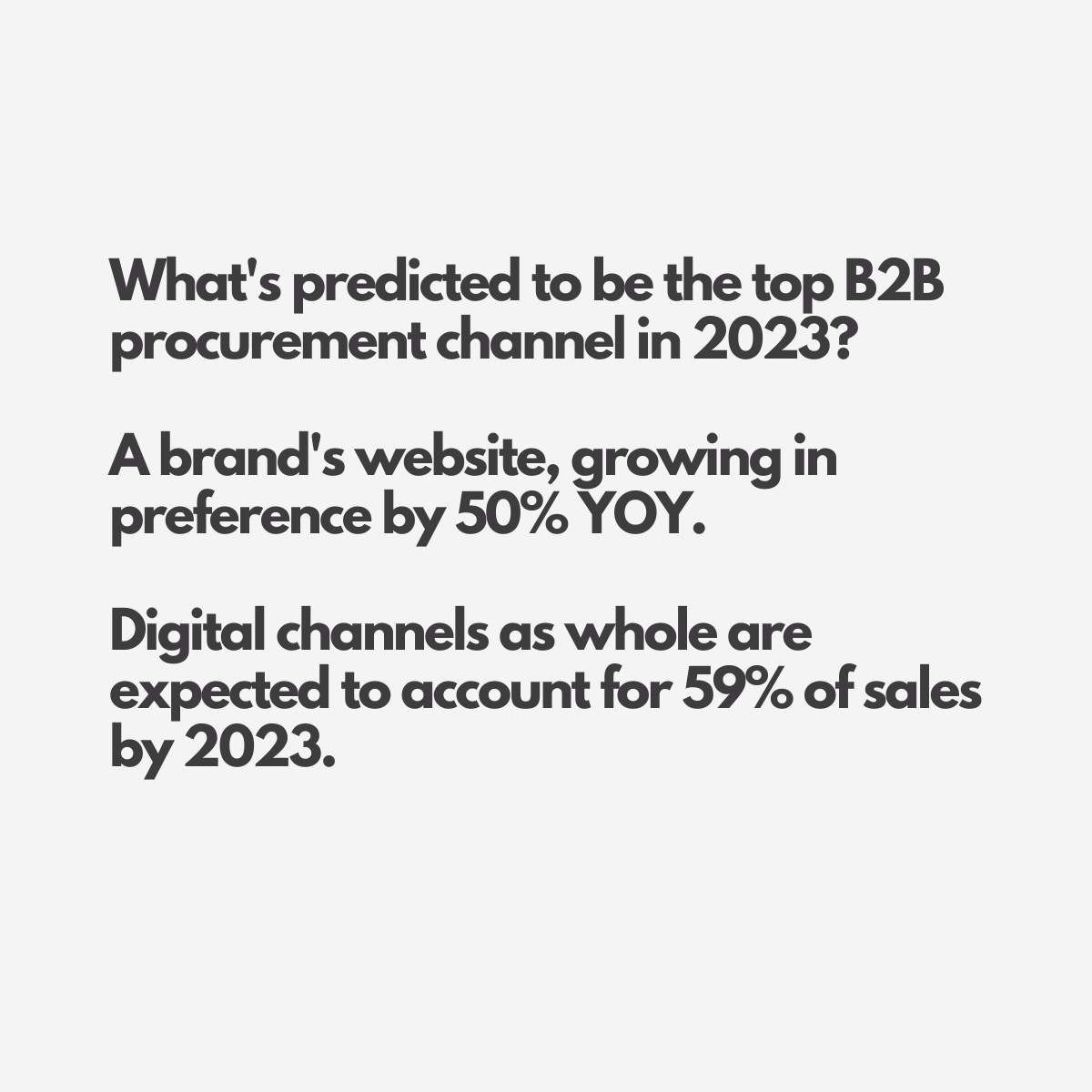
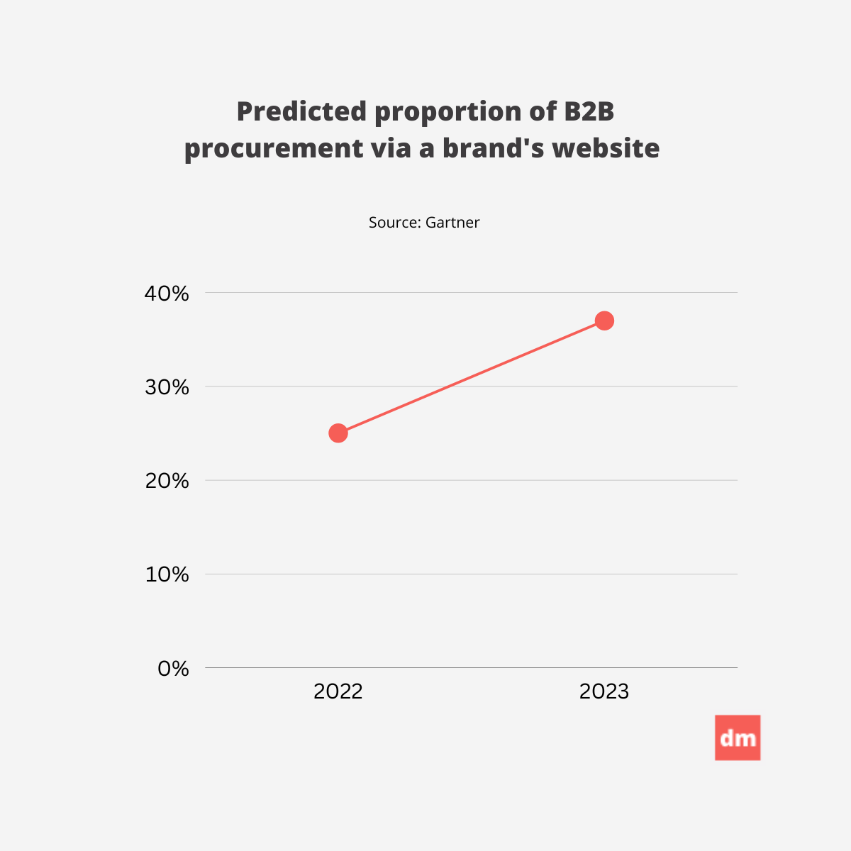
And now, some data on healthcare content marketing
A differential diagnosis
Ignore Optum’s landing pages. Steal from Allbirds.
TL;DR: In B2B healthcare campaigns, landing pages for lead magnets and demos need a major revamp and should reflect the potential value of a conversion. Consumer brands, not market leaders in healthcare, are the touchstones to pull from.
For B2B healthcare brands, whose contracts can be worth six or seven figures, a lead from a qualified account can be worth four or five. And yet landing pages, the conversion asset that often yields those leads, very rarely reflect that value. And they very rarely do the work to convince some of the most educated, opinionated, and suspicious buyers to exchange their contact information for your content or conversion offer.
Usually, in B2B, you’ll see the following:
a generic hero
a paragraph of copy and bullets
a form
a button with suboptimal CTA copy (“Submit”)
With only those elements, I’m not sure it’s fair to expect a consistent conversion rate. Maybe if you had a category-defining product or a brand whose direct traffic keeps going up and up. But in today’s landscape, that seems less and less likely.
Whose landing pages work hard for their leads? In my opinion, consumer brands, ironically, and DTC especially. Brands whose products cost a thousandth of a B2B healthcare product and whose customers churn like crazy blend aesthetics and consumer psychology to not only get an email address, but to get a visitor to take out their credit card.
A landing page for a $90 pair of washable wool gym shoes has a number of elements that can apply to a healthcare brand’s landing page. Some elements that I would borrow:
Multiple images or views of the lead magnet
Benefits and features of the lead magnet
Use cases for the lead magnet
Testimonials or reviews from early readers or internal experts
Data on how many downloads there have been (if higher than baseline)
Data on what roles (e.g., CEO) have downloaded the magnet already
A caveat: a beautiful landing page that addresses every visitor’s barriers may not exceed averages if the offer is subpar. Like a product launch, Eevery campaign, in my opinion, starts with the offer.
Napkin drafts of B2B healthcare marketing plays
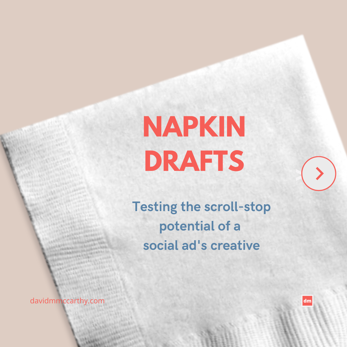
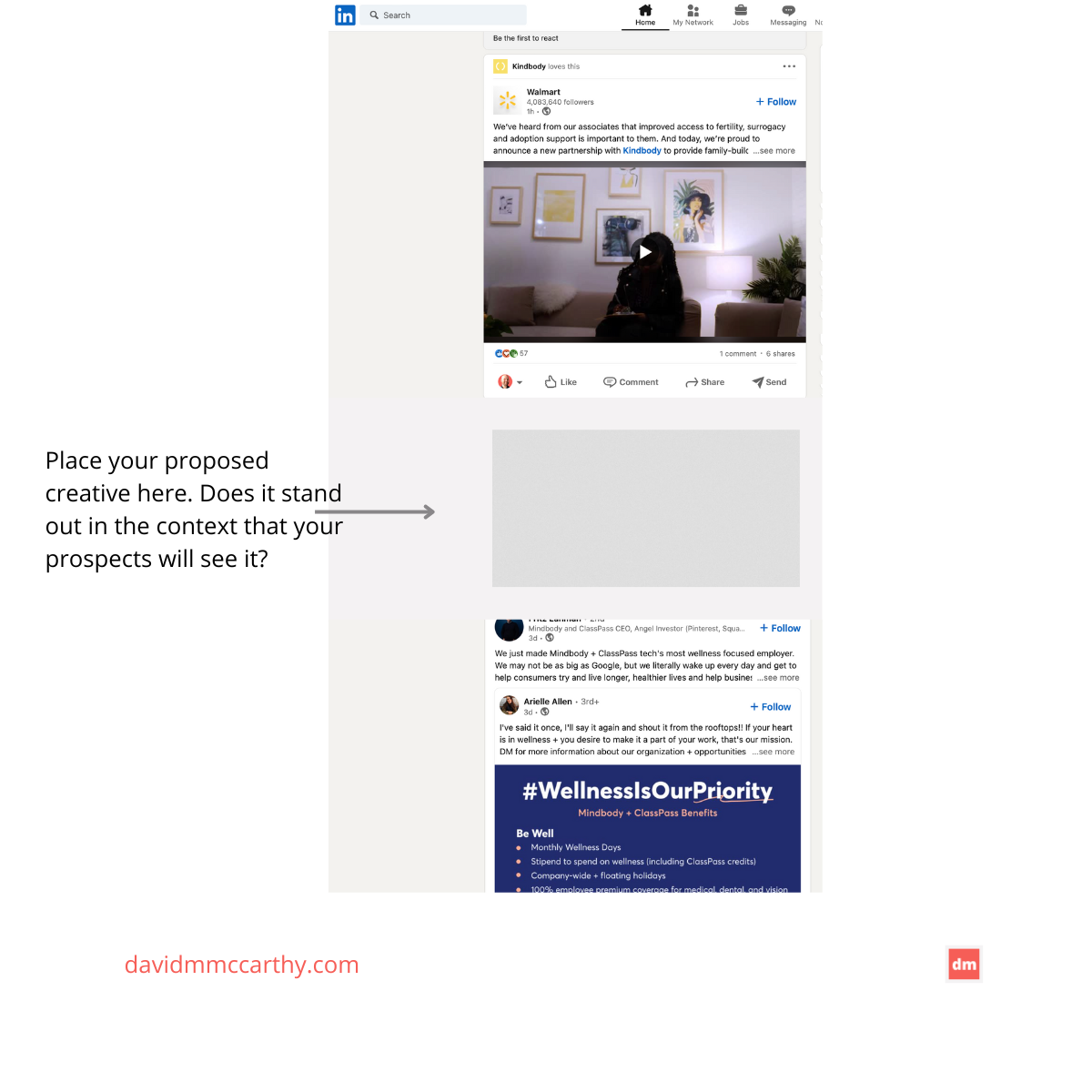
How to test a social ad’s scroll-stopping potential
For B2B healthcare marketing teams, creating a good social ad—one that drives clicks or conversions efficiently—always takes a surprising amount of work.
The offer has to be right, to start, and the ad’s design and copy have to look and sound like the brand, too.
But it’s not uncommon for teams to overlook a question when designing it: can the ad win in a social feed?
The question becomes particularly important if your target audience is not a follower (and haven’t raised their hand to see your content—yet.)
The ad has to have "scroll stopping" potential, too. Here's a quick, rough way to test that internally.
If a consumer brand designed a B2B healthcare ad
I’m not convinced that the trend in healthcare marketing to use joyful, in-the-moment people in imagery is the only option.
Other emotions can be powerful, too, I think. Research has shown eliciting sadness is effective at triggering the memory, for example. And I have to think that after the years we’ve had recently, solidarity and comfort are too, so I took a swing at creating a category-awareness ad for a navigation product, anchoring on those two qualities or emotions.
On marketing tactics
Google has finished up its most recent Core update. It may be too early to see its impact on organic traffic and SERP rankings, but the update again seems to favor high-quality content that serves search intent, rather than the brand’s intent. It also seems to reward better page experiences. Get the details
Gartner reports that most marketing teams are not fully realizing their tech stack’s value or capabilities. Read more
Organic reach on Facebook and Instagram is, unsurprisingly, dropping significantly. I imagine a recession would prompt Meta to drive organic reach down even more. Dive into the data
Sometimes I post on LinkedIn, too
A brief disclaimer
I reference and link to many healthcare brands in the newsletter. Including them does not signify an endorsement of their business.

